Home / Case studies / Silicon Drive
Case study · Brand identity · mobility
Silicon Drive: Rebrand from sedan to storefront
Identity project · no media · full rollout
23 yrsTransport heritage
10Touchpoints rolled out
1Identity system
The brief
The challenge
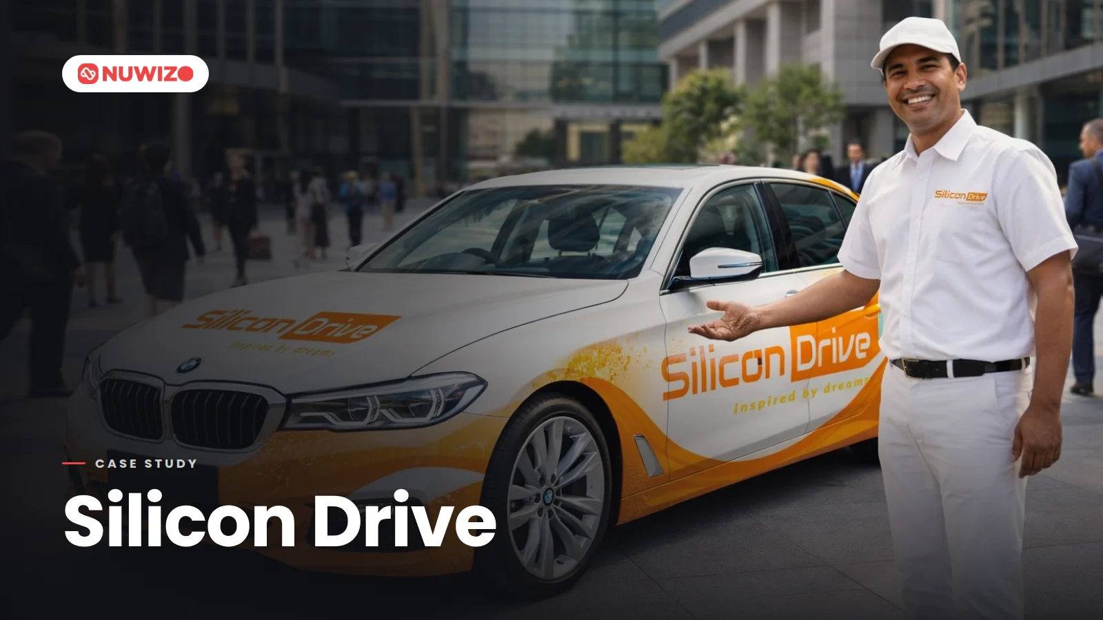
A 23 year old transport company relaunching as a technology brand. It needed to look like a platform rather than a fleet.
The work
What we ran
- A wordmark with a forward arrow hidden inside the letter o
- Liveries across sedan, MPV and premium vehicles
- App icon, uniforms, lanyards, signage, billboards, stationery and storefront
See how we market transport and logistics companies: logistics marketing agency in Bangalore.
The result
Full identity built end to end and rolled out across the fleet, the app and the street. Nobody sees the arrow first. Everybody sees it second.
The identity, rolled out
From the letter o to the street




Enquire now
Want numbers like these?
Tell us the one metric your sales team trusts. We will show you how we would move it.
- A reply from the person who will run your account
- Media plan built on your numbers, not a template
- Every lead qualified on NuwizoAI